Random is always a bad idea when describing something. Perhaps colors would make them a little easier to distinguish. And i like words instead

Or even better, no words & icons at all.
Maybe "always a bad idea" is a bit strong. I would say, "Describing something with randomness pushes your communication into the realm of
symbolism - further toward L-mode, in other words." If something has no connection with the thing it is describing, it is a symbol. Like words, like language. What does the sound of "smile" have to do with the actual thing it signifies? Nothing.
This, however, is a symbol, but with a closer connection to what it symbolizes: 
In the case of emoticons, the difference between the symbol and what it symbolizes does not destroy the meaning, it just makes it more general. It gives it a more universal connotation than an exact image of a specific smile.
So...
The existing alternative to random icons is "random letters" - words. I think the random icons are still an improvement in being somewhat more R-mode friendly, in that they are recognizable from a distance when selecting one among many, without having to "read" each one individually like you would with words. Of course, words have the advantage that once you
do read them, the associations evoked are usually much more memorable (and relevant!) than those of a random icon. Still, we are talking about R-mode readability here, and if it takes an extra mental dip into L-mode to actually
read the word before you get that, words are useless to us.
A choice of using an icon or a label or both per node could be practical.
But you are suggesting that we use neither words nor icons.
In that case, what is the alternative that you suggest? Just using identical boxes for each node would not be an improvement, at least for me.
Are you suggesting to represent the specific properties of the node visually, then?
You could do this with the invaders - instead of generating a random bitmap, generate a bitmap deterministically from the data of the node. Though a simple binary dump of the data would probably be too incomprehensible to be useful. There may be a way to use that general idea to make a more functional visualization though.
What do you suggest?
Update:Invaders with colors:
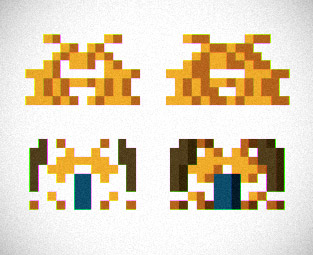
When you are using arbitrary symbols, it's good to have only a few of them, so they're easy to memorize. That's an advantage colors have - you can use a limited set, and they easily group into categories (red, yellow, green, blue, dark, light, warm, cold, etc.). And they are even easier to distinguish from a distance than the invader icons.
With colors, icons, and labels, we'd be getting somewhere. Still symbolic though. How do we drill down into representing functionality directly?
Maybe getting beyond the lines-and-boxes paradigm, to something that makes more efficient use of spatial relationships
between nodes, not just within?

 I want to make something, instead of thinking about how to make it.